

Navigation redesign
Navigation redesign


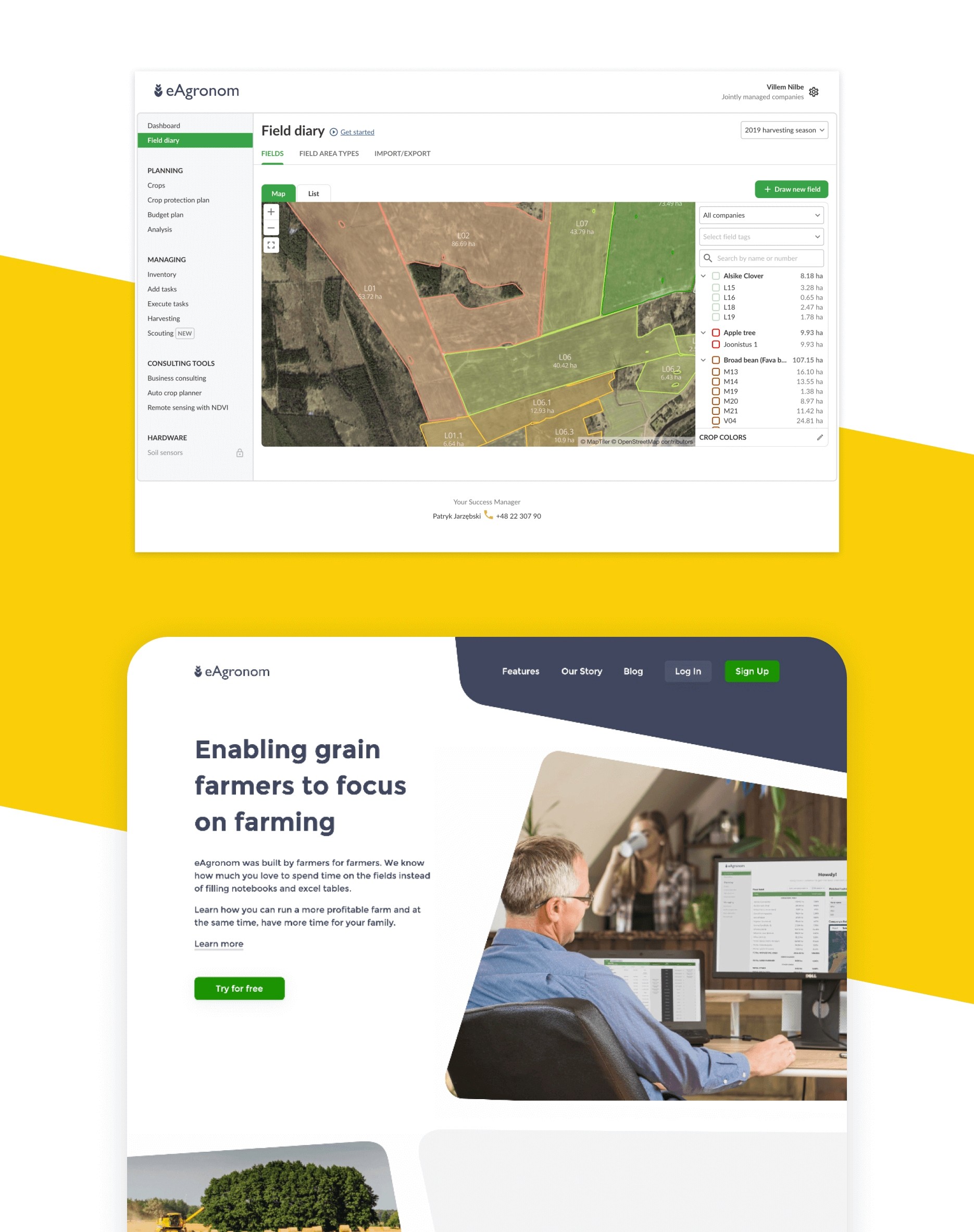
eAgronom is an Estonian-based company with a strong farmer network, that aims to bring powerful digital tools to a growing number of farmers all around the world.
Design team
Villem Nilbe — Product design + research
Uku Pattak — Product design + research
eAgronom is an Estonian-based company with a strong farmer network, that aims to bring powerful digital tools to a growing number of farmers all around the world.
Design team
Villem Nilbe — Product design + research
Uku Pattak — Product design + research
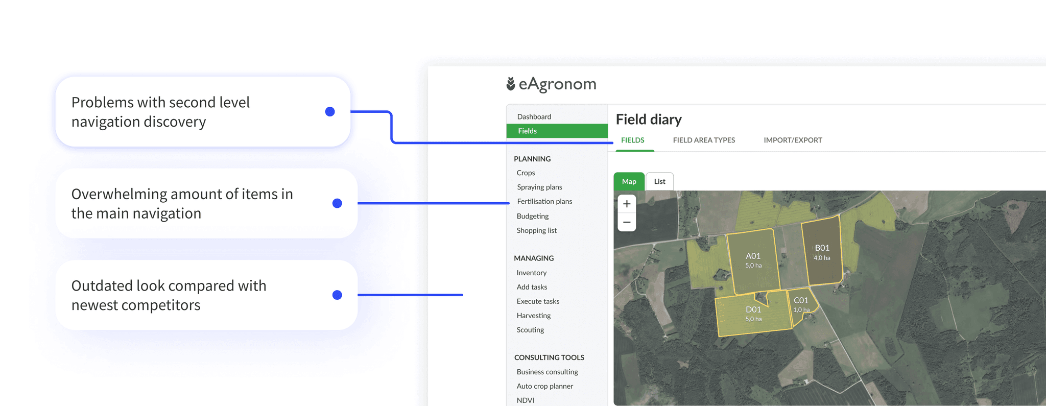
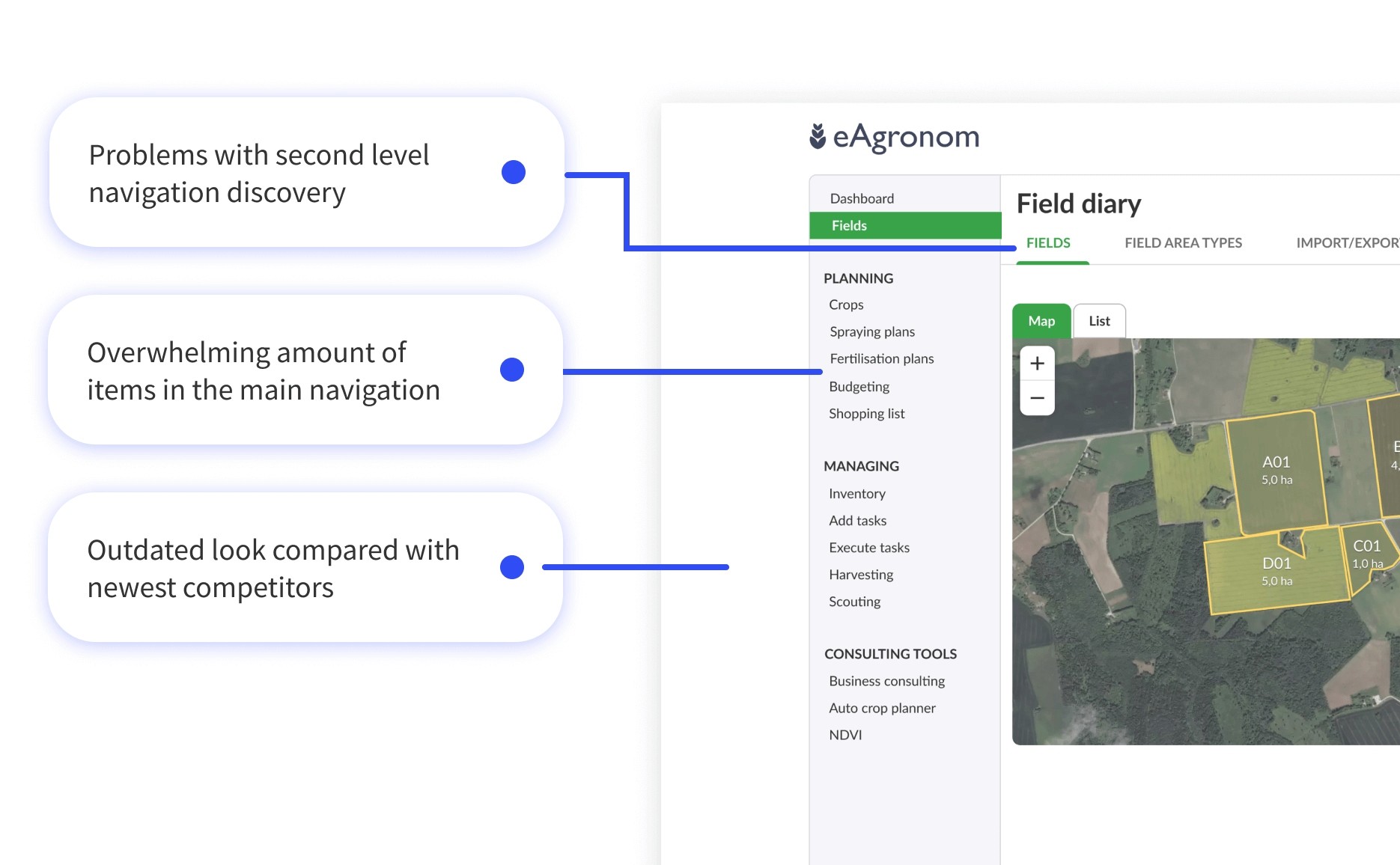
It was hard to discover features during new user onboarding. A lot of onboarding is done by personal training with account managers, but this is not scalable.
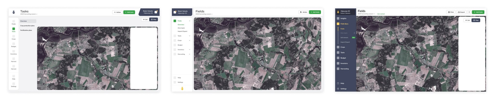
As the feature list had grown over the last few years, navigation had so many items that it was hard to go through them all without giving users cognitive overload. In addition to that navigation was both on the side menu and the top in the form of tabs. This made users miss out second level links on the top, which is at least 50% of all functionalities.
It was hard to discover features during new user onboarding. A lot of onboarding is done by personal training with account managers, but this is not scalable.
As the feature list had grown over the last few years, navigation had so many items that it was hard to go through them all without giving users cognitive overload. In addition to that navigation was both on the side menu and the top in the form of tabs. This made users miss out second level links on the top, which is at least 50% of all functionalities.
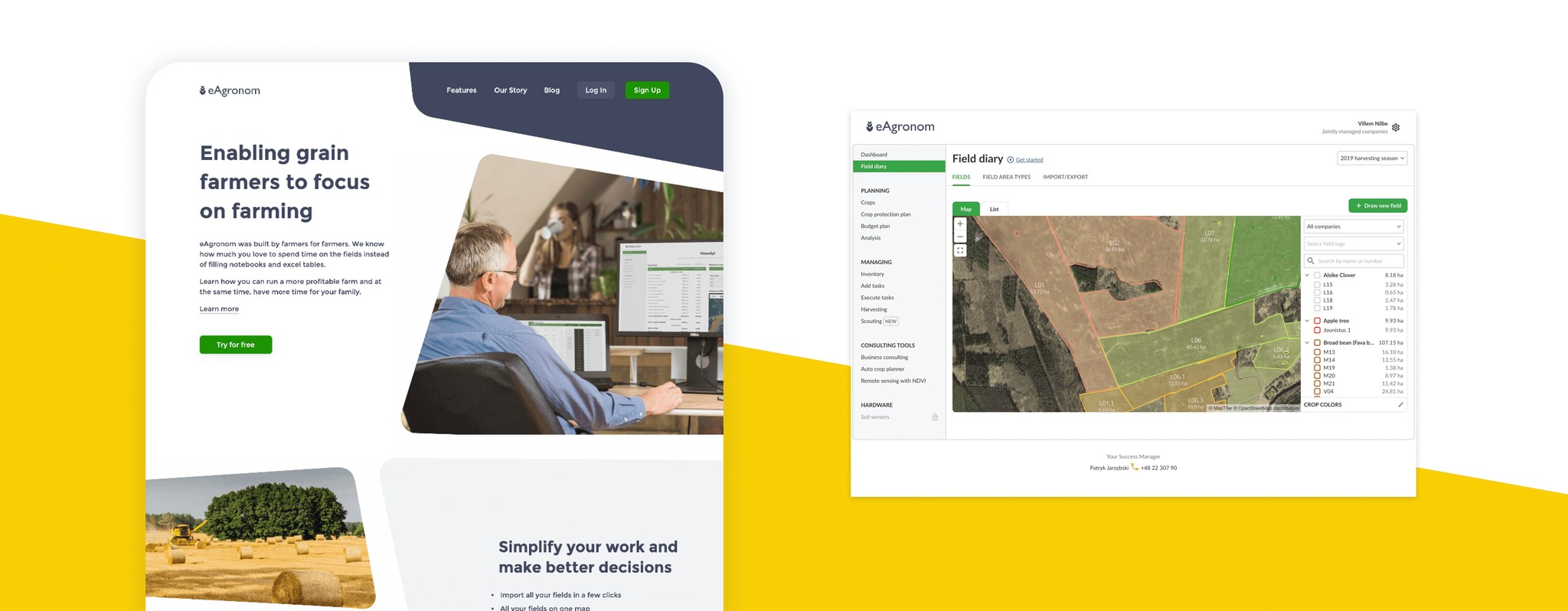
The design of the product is not up to date with branding. Coming from our landing to our product feels like two different experiences. This undermines the trust that marketing is building.
Navigation had a disappointing and outdated look compared to our latest brand and to the newest competitors (e.g. OneSoil) which heavily influenced how potential users value, i.e. users’ perceive attractive products as more usable and valuable. They tend to believe that things that look better will work better - even if they aren’t more effective or efficient.
Bring software visually up to date with branding visuals. Success is measured by the marketing team and other in-house stakeholders' approval.
Make navigation more intuitive and make sure users discover features and have an overall more satisfying user experience when navigating between different pages. Success is measured by feedback given by users after onboarding them to the new navigation.
Quicker and less demanding onboarding experience by simplifying our navigation. Success is measured by feedback from account managers about the length and complexity of training and user feedback during training.
Motivate the whole team who had been waiting for navigation and visual update for quite a long time already.
In the early stages, this was a designers’ passion project. We were quite aware of the surface level problems with our current navigation from collected user feedback already before the project. Based on that we made some initial prototypes.
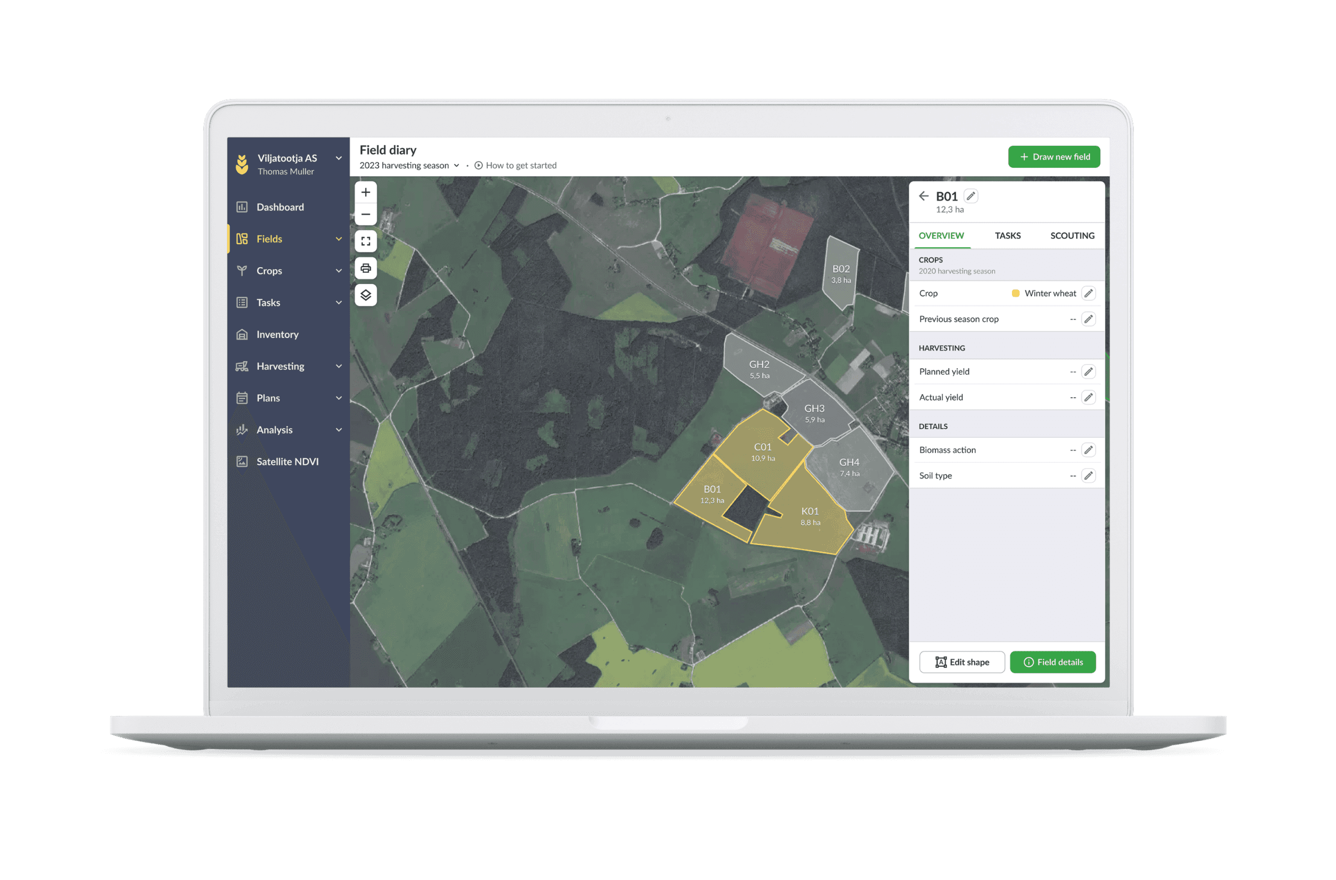
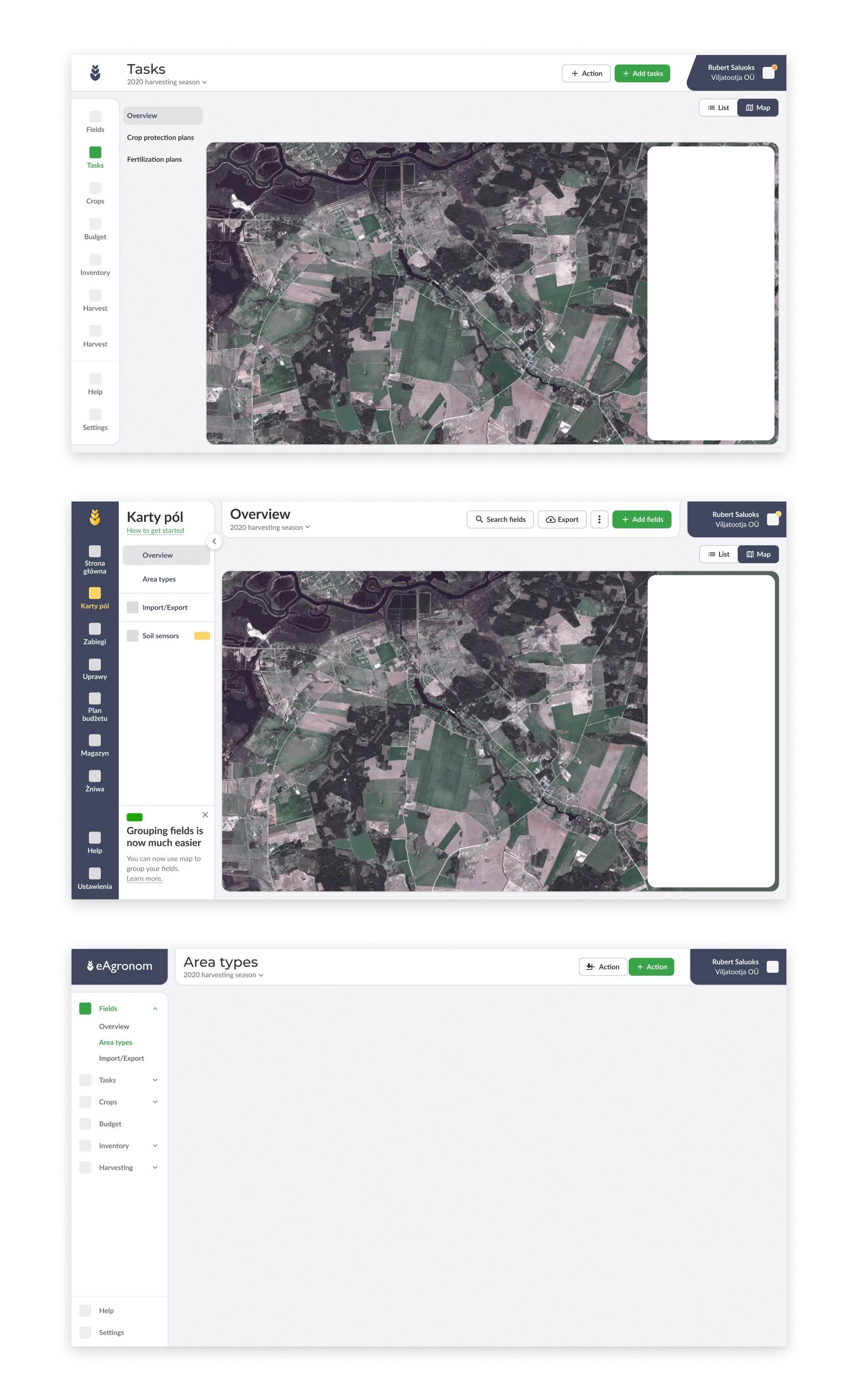
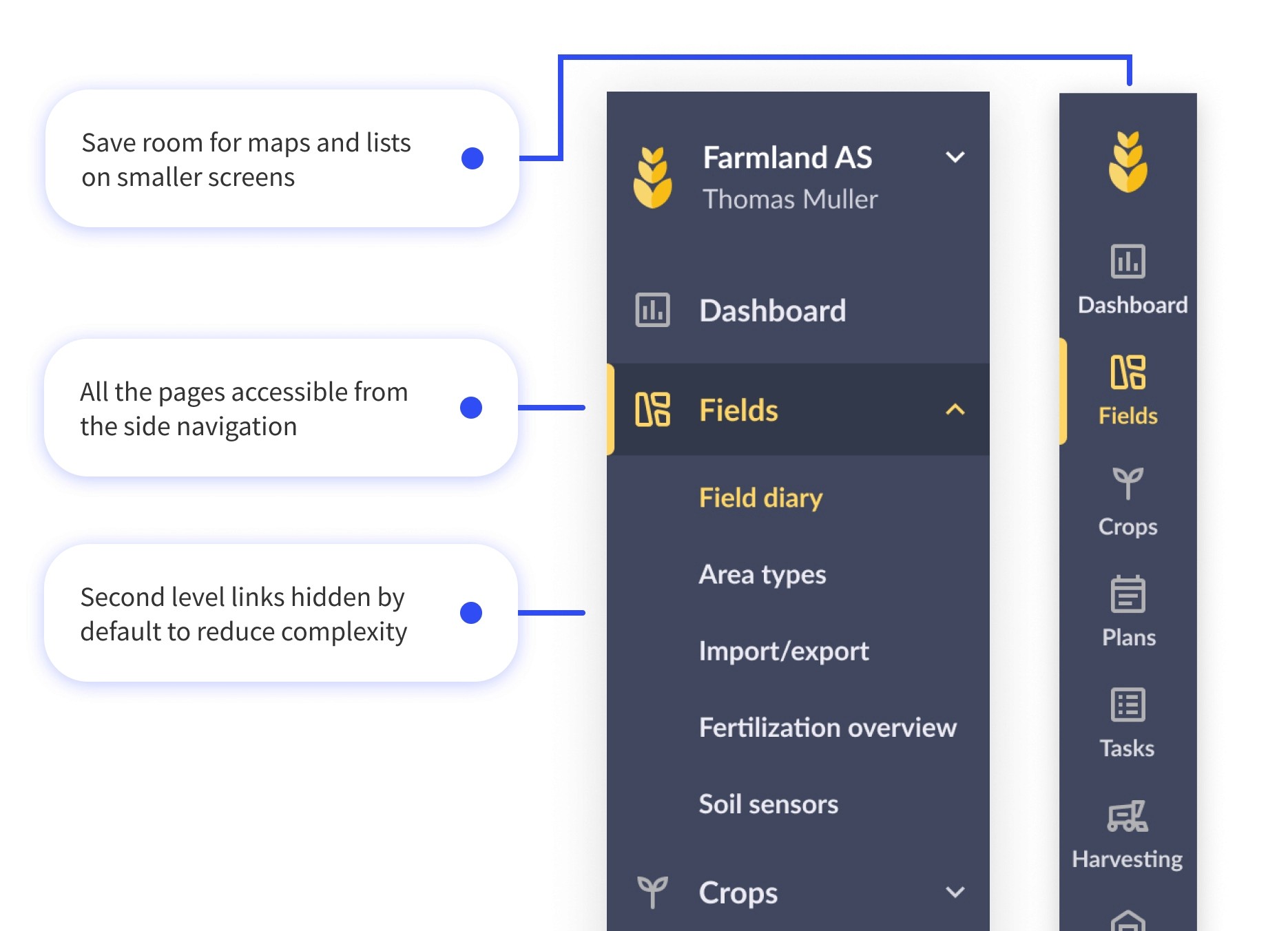
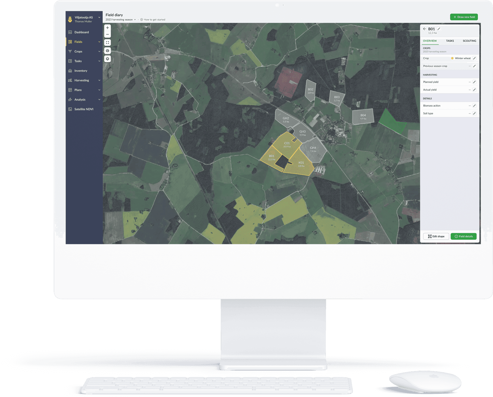
The main focus at this stage was to simplify our navigation with all the current 25+ pages and give more space for one of the main tools — maps.
In the early stages, this was a designers’ passion project. We were quite aware of the surface level problems with our current navigation from collected user feedback already before the project. Based on that we made some initial prototypes.
The main focus at this stage was to simplify our navigation with all the current 25+ pages and give more space for one of the main tools — maps.
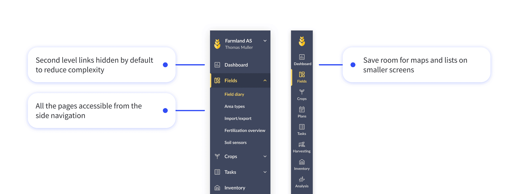
We started showing prototypes of new ideas to users during different research calls, farm visits, and internal stakeholder meetings to get some initial feedback and iterate quickly. The overall feedback to the idea of bringing both first and second-level navigation to the side was preferred by everybody.
Outcome:
Bringing all navigation items to the side was a good idea. But we needed to iterate to make it more intuitive and reduce visual noise.
Most of the research with users was done in the later stages. Where we organised usability testing with our current users to see if we had improved discoverability and would not disrupt their current workflows too much. For that, I created a few scenarios where users had to find different pages.
Most of the research with users was done in the later stages. Where we organised usability testing with our current users to see if we had improved discoverability and would not disrupt their current workflows too much. For that, I created a few scenarios where users had to find different pages.
Outcome:
Outcome:
At the end of the testing users found all the links without any major blockers. Users didn’t feel like there would be a massive learning curve when we would develop the new navigation.
At the end of the testing users found all the links without any major blockers. Users didn’t feel like there would be a massive learning curve when we would develop the new navigation.
In the new design, we planned to structure links under broader categories. We were still skeptical about whether our structuring of pages is the most logical one. To find out, we let 3–5 users from major markets sort all of our pages (27 at the time) into categories that they felt most intuitive to them.
In the new design, we planned to structure links under broader categories. We were still skeptical about whether our structuring of pages is the most logical one. To find out, we let 3–5 users from major markets sort all of our pages (27 at the time) into categories that they felt most intuitive to them.
Outcome:
Outcome:
We don’t want to disrupt our current users too much. Almost all of the people in the card sorting exercise pointed out their fear that we would change the order of things and they would have to learn to use it again.
We want to reduce the number of links. We had links in our main navigation that was not used at all for the last few months. Navigation is not something you want to over-flood with things that are not used. After that research we had a look into our feature usage and what we should keep in our navigation. This card sorting was an eye-opening experience of how messy and overcrowded our information architecture was. Since then we have killed, moved under settings, and merged a couple of our features.
Redesigning the whole navigation in one development is scary for designers, developers, and users. To alleviate those fears we chose to scope and develop the entire redesign in independent steps. In the end, this approach proved to be successful as we got a lot of feedback on each step and we could find and fix bugs quickly.
For users, we tried to alleviate the fear of having to learn something new by releasing the new navigation after the harvesting season. It is the least busy and stress-free season in farming.
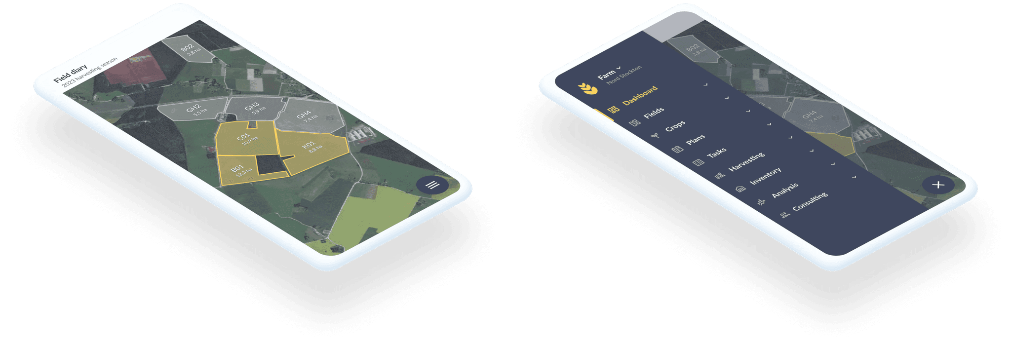
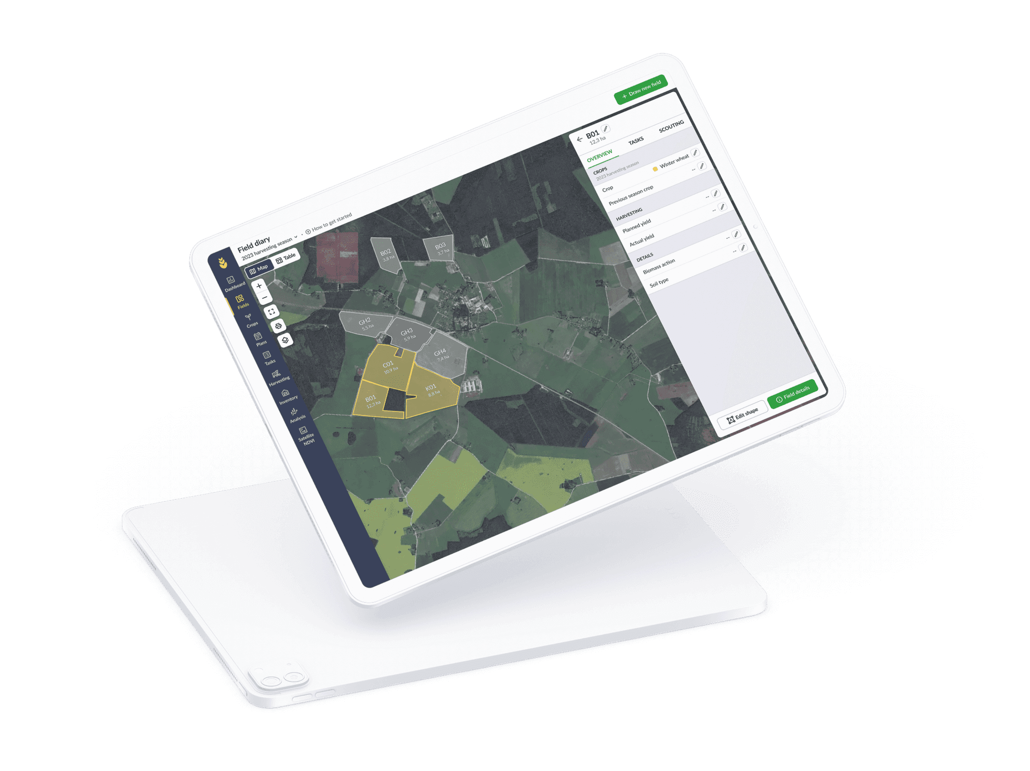
In the final solution, we cut down on the number of links, categorised the side navigation in more logical ways, and gave a lot more room for maps and other content.
In the final solution, we cut down on the number of links, categorised the side navigation in more logical ways, and gave a lot more room for maps and other content.

The results of this development are mainly from qualitative interviews with users and feedback some of them have given to customer support. In the new navigation onboarding flow, we included a feedback CTA which prompted users to give us feedback.
Most of the feedback from there was positive. Users found the new navigation to be faster to use and found features that they had never noticed before.
In user feedback, we had 2 users who gave negative feedback because they wanted to use eAgronom for a quick thing, and then they were confronted with this new change.
Overall in-house stakeholders were happy with the updated look. Matching the software design with branding was obvious to everybody.
It’s important to know your clients and their habits to time releases accordingly. We looked into task activity and even made the release at different times depending on when the busiest season, harvesting, will end in their region.
Always keep thinking about how much change in the UI and logic is needed to have improved experience, but not to overwhelm your clients with having to learn new ways of doing things.
Redesigning our navigation was not a silver bullet to fix our onboarding experience. We are currently starting a research & design project looking into onboarding, but the new layout and navigation research and design laid a good foundation to build on.